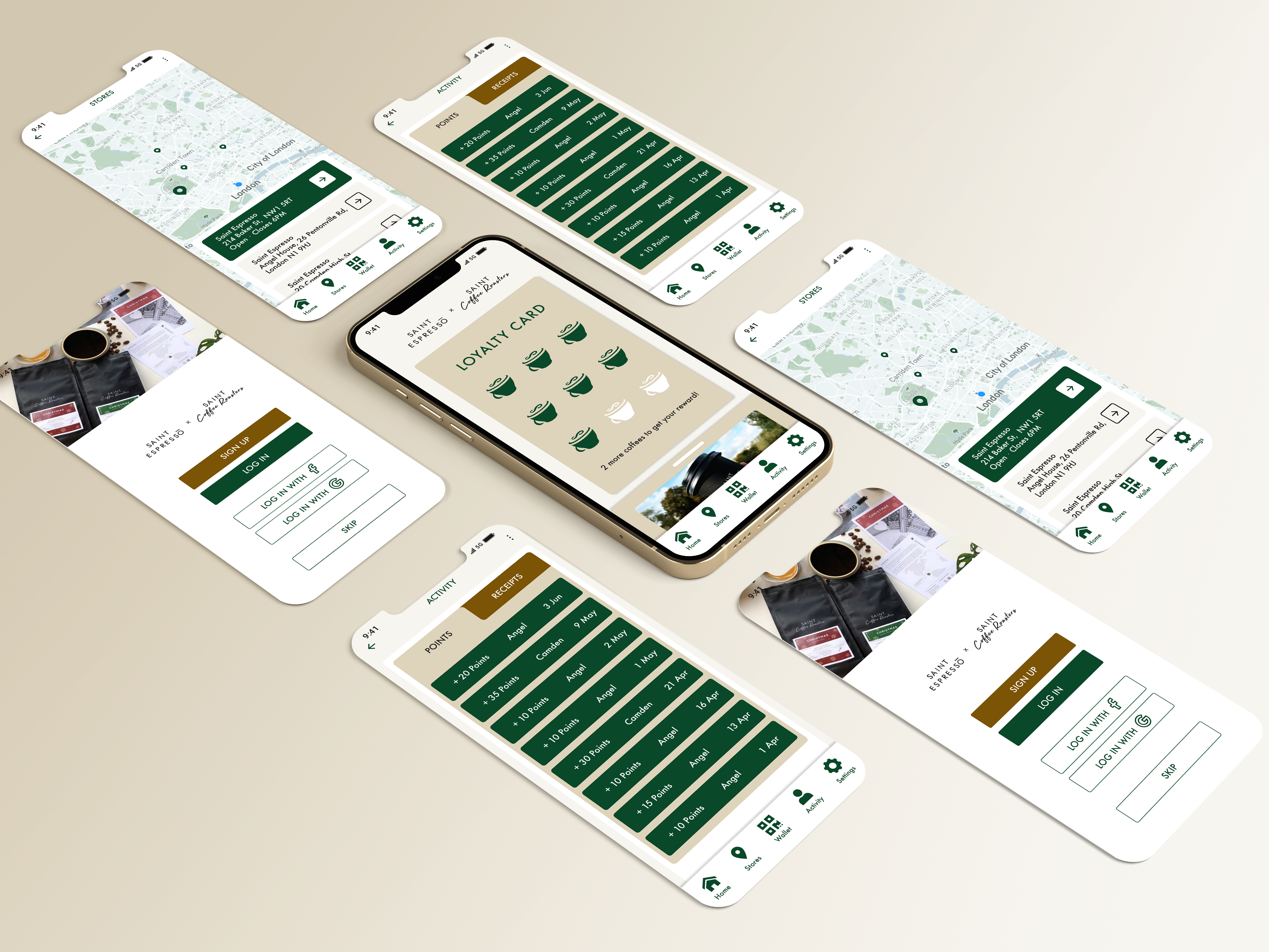
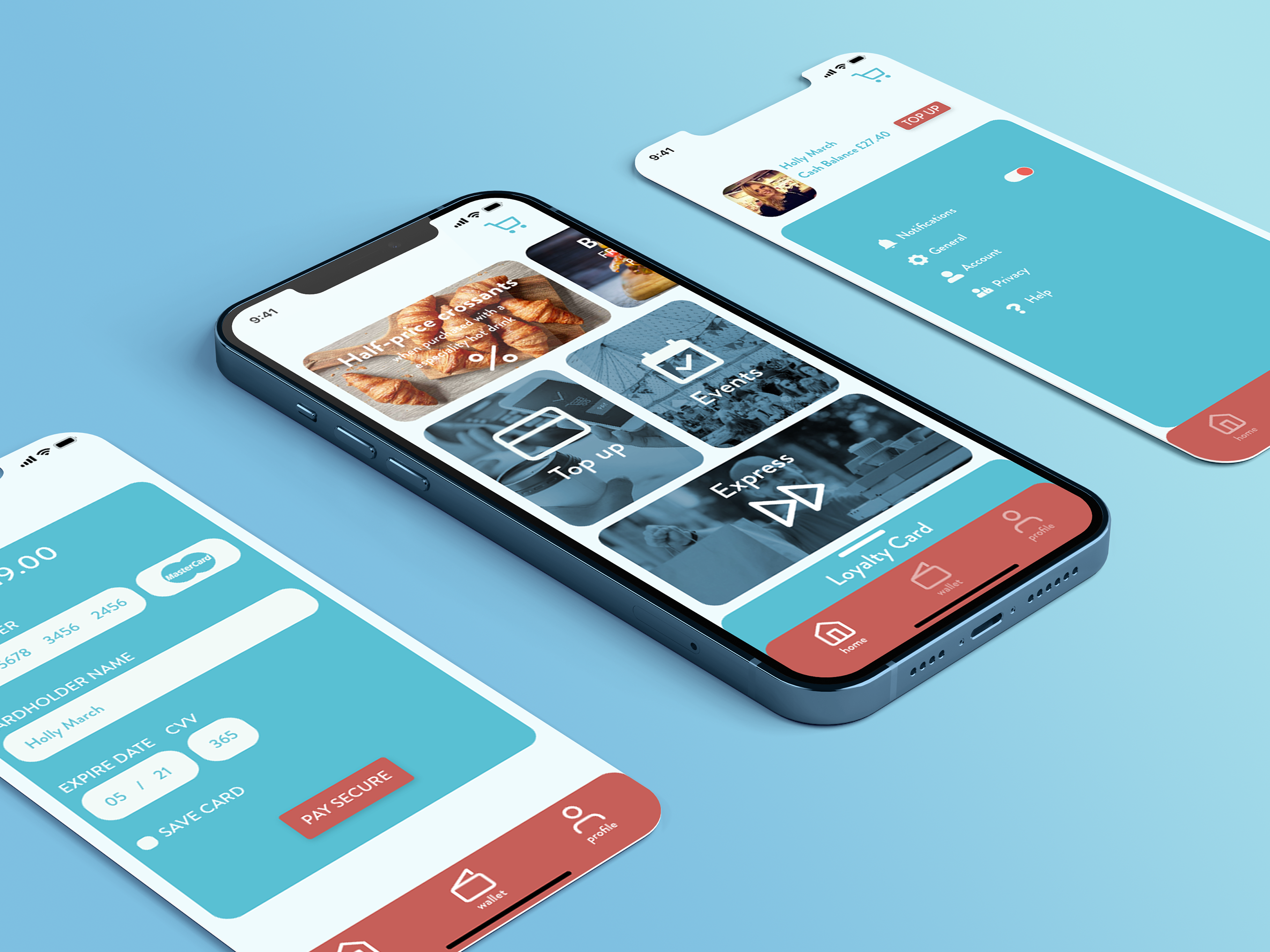
Project: Smart Licensing Company Ltd.
Project scope: Rebranding Logo/Redesigning Website (responsive)
Tools: Adobe XD/Photoshop/Illustratore/Dreamweaver
Deliverables: Research/mood boards & style tiles/user testing/wireframes/prototypes
Project overview:
Smart QMS is a specialist ISO Standard Management Systems Consultancy provider with expertise in the successful design, development, implementation, training and internal auditing of ISO Standards series. The company have been planning to improve the overall user experience journey by enhancing accessibility and efficiency of their online platform and invest on a well-designed responsive website due to pandemic and high demand of online customers and remote working.
Challenges: to improve the visual design, usability and content strategy of the website.
Design Process:
Choosing right project management model used for this project was vital. After carful consideration of the project’s aspects I’ve came to conclusion to use Agile model.
In sprint 1 I have conducted exploratory research on the industry in the UK. Designed a set of style tiles along side with an unmoderated desirability studies.
Low fidelity wireframes has been designed and another set of usability testing took place in Sprint 2. I’ve started rebranding the logo in line with the new design style. A meeting took place with CEO in regards to the final design direction and going forward with design style, having a set of expert reviews on board.
we’ve decided to go forward with one of the design styles based on the result of the tests.
High-fidelity wireframes has been designed and went through the final usability testing in Sprint 3.
The final logo design has been approved by the client.
Design Directions:
3 different styles tiles has been designed in line with pain points and goals of the project. At this stage the brand identity has been in the centre of the attention while trying to create 3 set of mood-board and styles tiles in order to reflect content hierarchy.
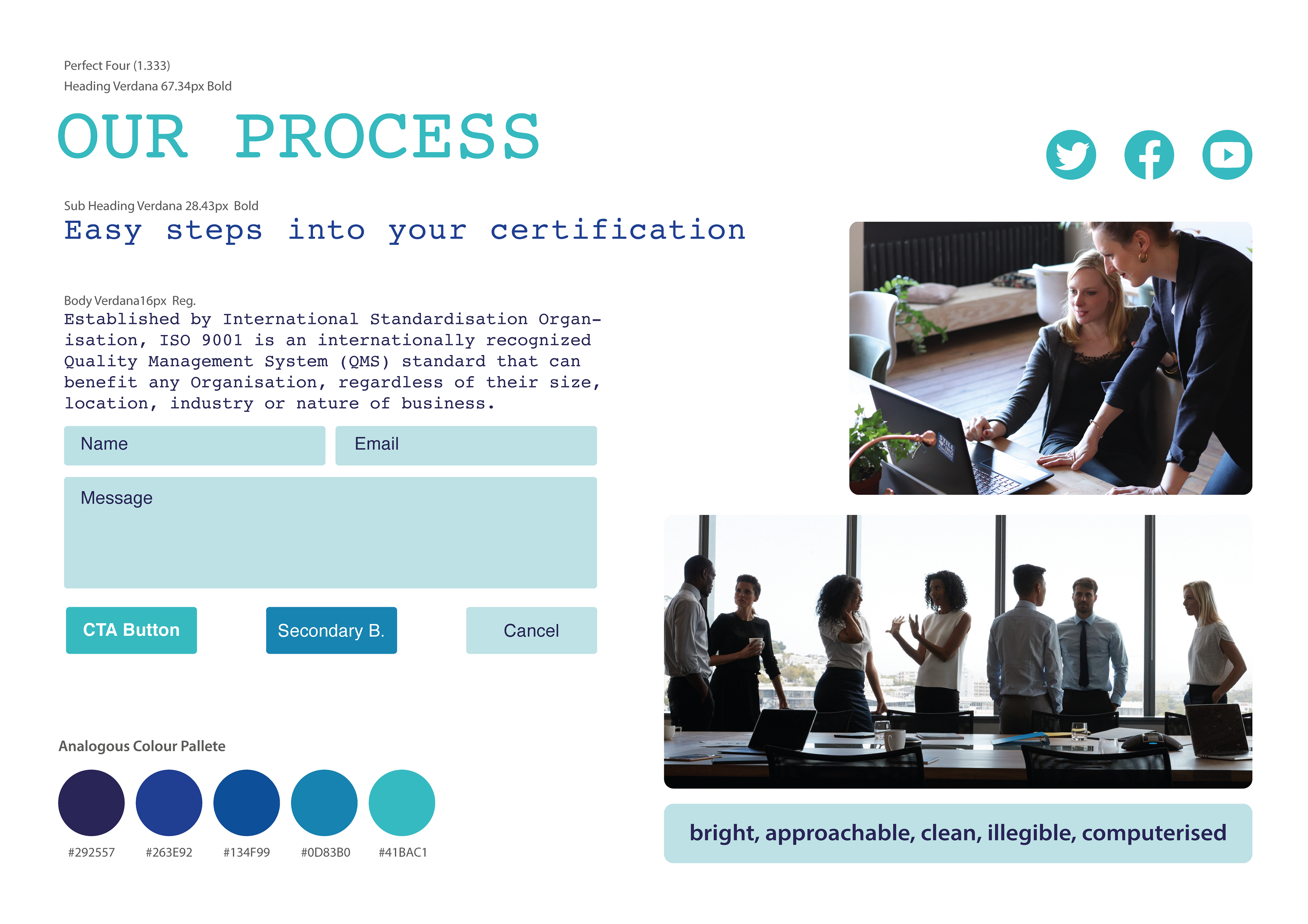
#1 This style tile has been described as sharp and strong by most of the users. I’ve used the Shades colour palette for this style tile. Images selected for this design all have a moderate navy-blue shades and monochrome style has been applied to them. The main colour shade #134F99 is the same as the logo and is in great contrast with the white background. Most of the users have been very positive toward this style describing it as formal and legible.
#2 The second style tile is using Analogous colour scheme which result in a more moderate approach to styling. Most of users have seen this style as more clean and approachable. Although the colour palette was well receipted by users, they were mostly believed this doesn’t relate to the purpose of the website though.
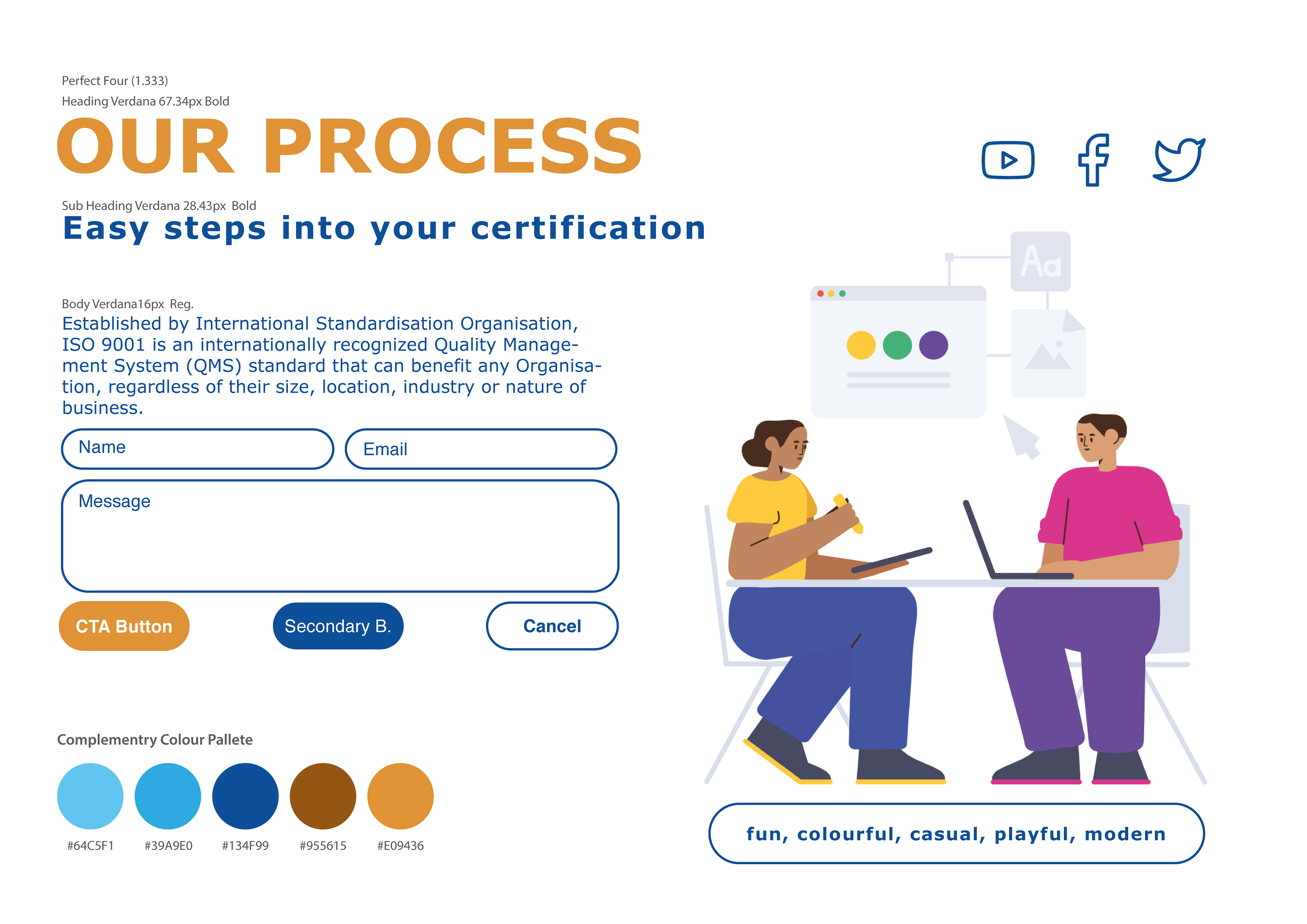
#3 Perfect Forth (1.333rm) font scale system has been used for this style tile and through out the rest of the mood boards. Using illustrations instead of images gave this design style a more contemporary approach. Users seen this mood board as a playful and modern design. The main reason to this is coming from the use of Complementary colour palette and elimination of hard edges and corners.
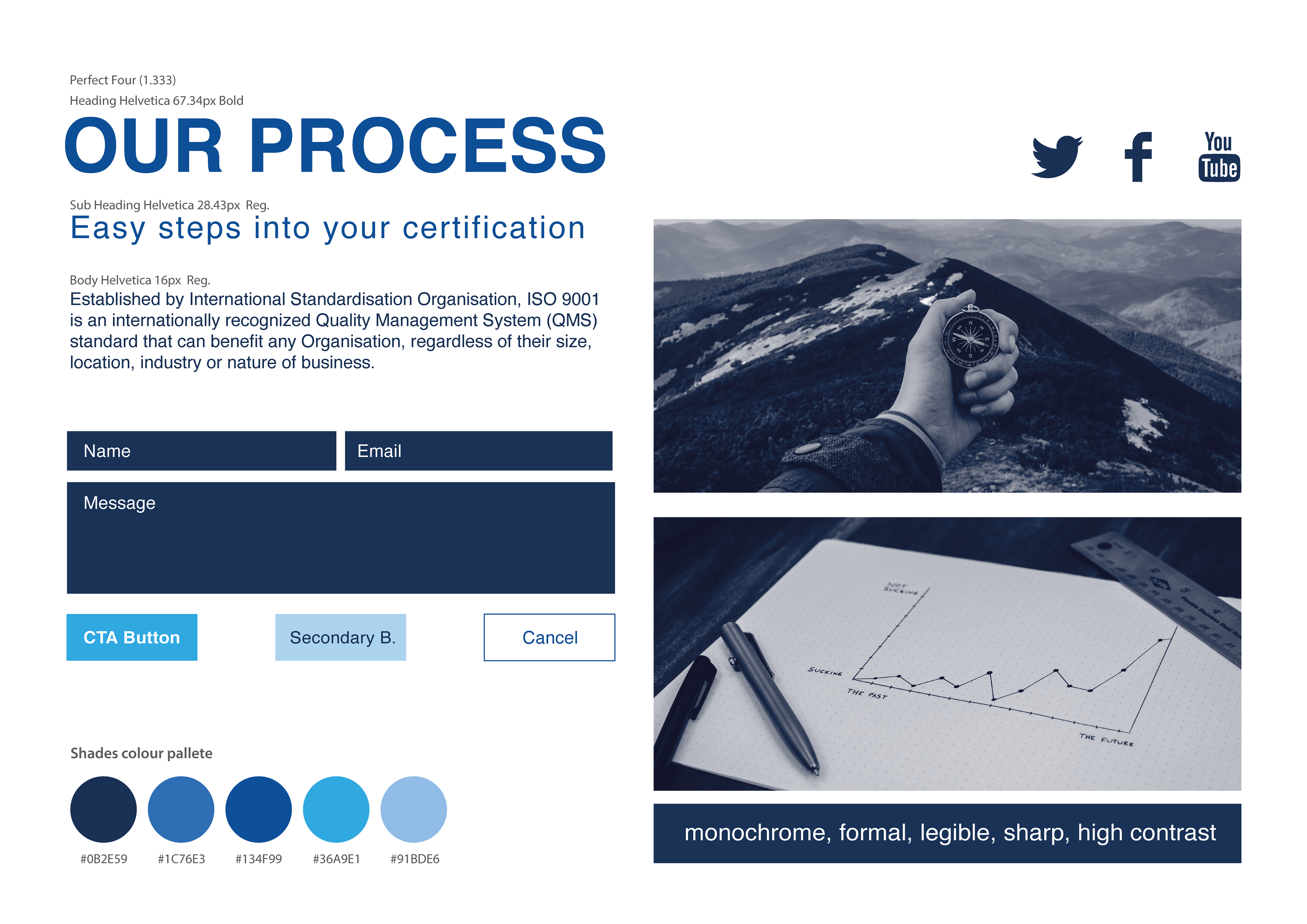
Style Guide #1
Style Guide #2
Style Guide #3
Logo Design:
At first of this project my client wasn’t willing to change the logo of the company as they’ve already had few customers and they though it might effect their business in a negative way. I had couple meetings with CEO and stack holders and explained how a redesign of their logo can boost the whole look of their business and their credibility. They eventually came on board but they want to keep some element from the old logo. In line with that I’ve decided to use the tick shape from old logo and implement that in the new design. I’ve also used a specific shade of blue to create the theme that is used in the mood boards.

New Design
Old Design
Old Design:
The original design of the website is lacking visual hierarchy and design system. The website design doesn’t translate into a professional look and create unappealing visual experience.
There is no visual system such as colour palette and information architecture.
No usability test has been conducted and as the result we don’t have a functional design. It’s hard to understand the main message of the business and users struggle to navigate through the website.
Old Design
New Design
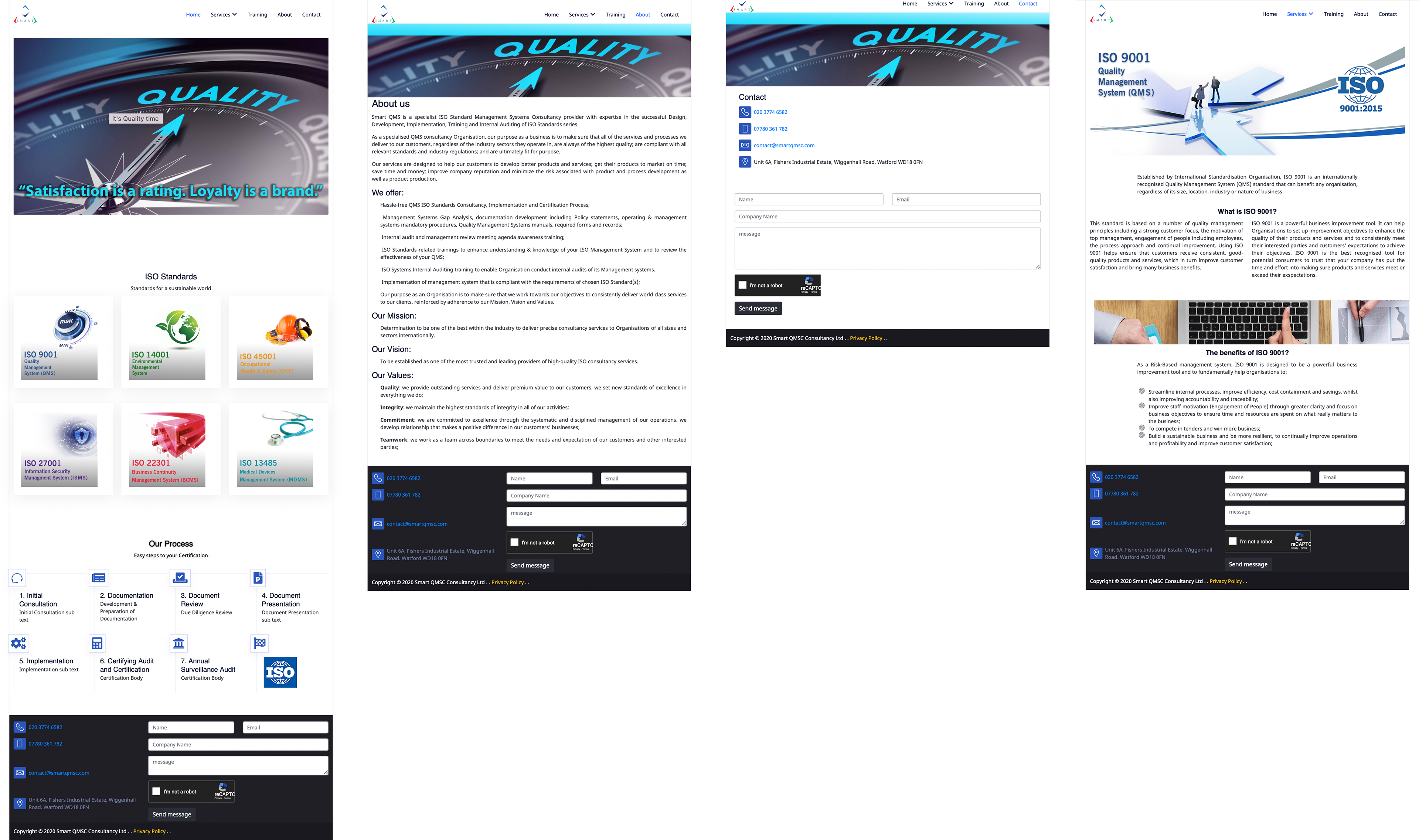
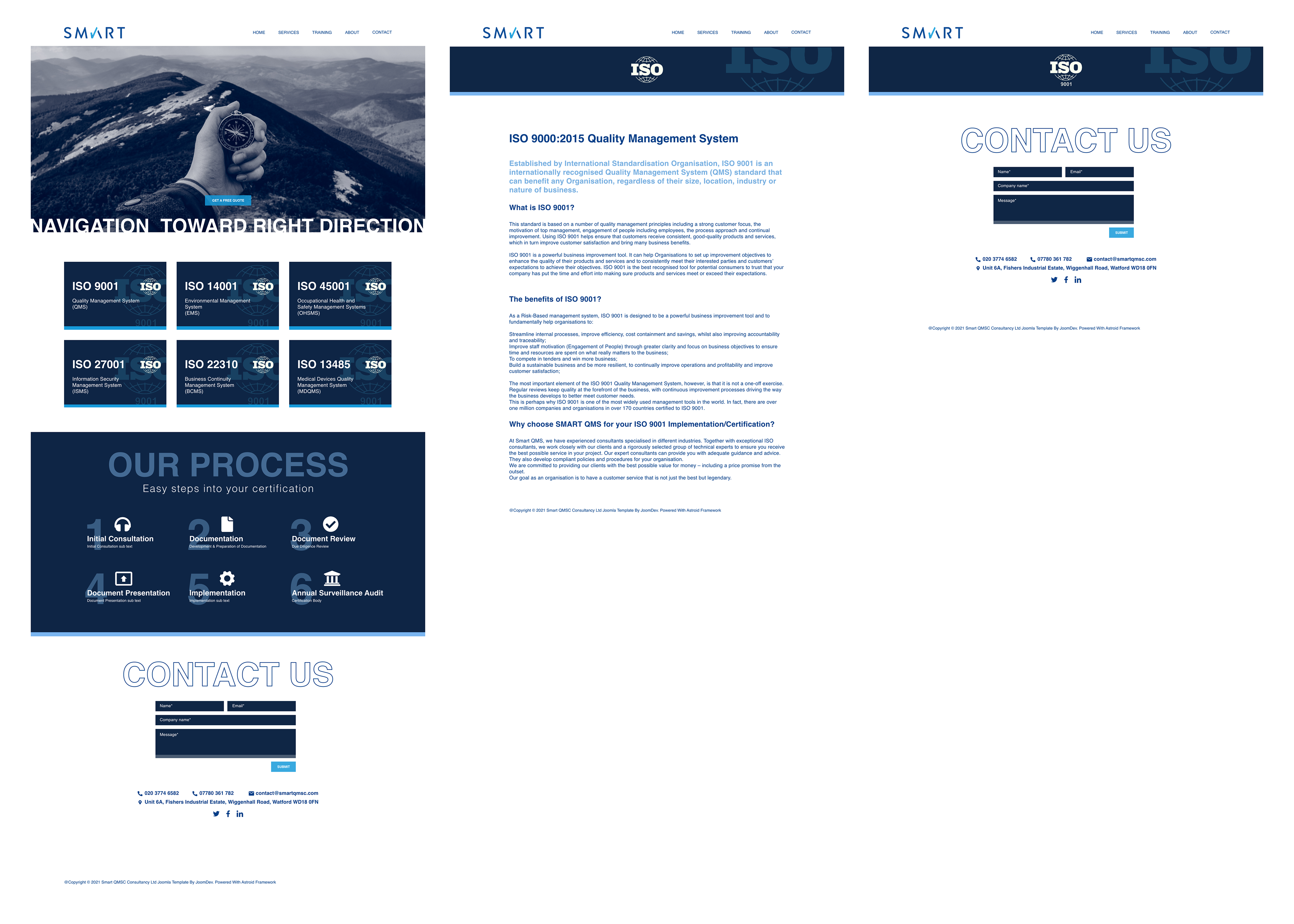
New Design:
A low fidelity wireframe has been designed and a series of usability tests has been conducted.
Based on the result from the first sprint three different moodpboard has been designed and a new series of usability test took place followed by an internal usability test to find the design language for further actions.
By having a clear idea of the design language, I’ve designed a high fidelity wireframe of the interactive website and put that to the last and third round of usability test.
The final logo design has been added to the final website design and handed over to the client.