Project: Food on campus - University of Brighton
Project scope: Designing Logo/Redesigning App (responsive)
Tools: Adobe XD/Photoshop/Illustratore
Deliverables: Research/style tiles/user testing/wireframes/high fidelity mock ups/prototypes
Project overview:
FOOD ON CAMPUS are responsible for providing a range of support services and the delivery of food and beverages, to students, staff and external visitors. Food on Campus mobile App gives students and staff ultimate access to food and drink outlets across University of Brighton campuses. Opening them up to all the food and an easier way of budgeting their weekly shop. Residential & Hospitality Operation have been planning to improve the overall UI/UX of their app. They invest on a well-designed responsive mobile app to generate higher income as well as high demand of online customers.
Challenges:
improving the visual design, usability and content strategy of the application.
Design Process:
The first idea of redesigning the app came from an internal research under Deals & Promotions Project. We’ve been looking into improving our business strategies when we realised the need of an update to the app.
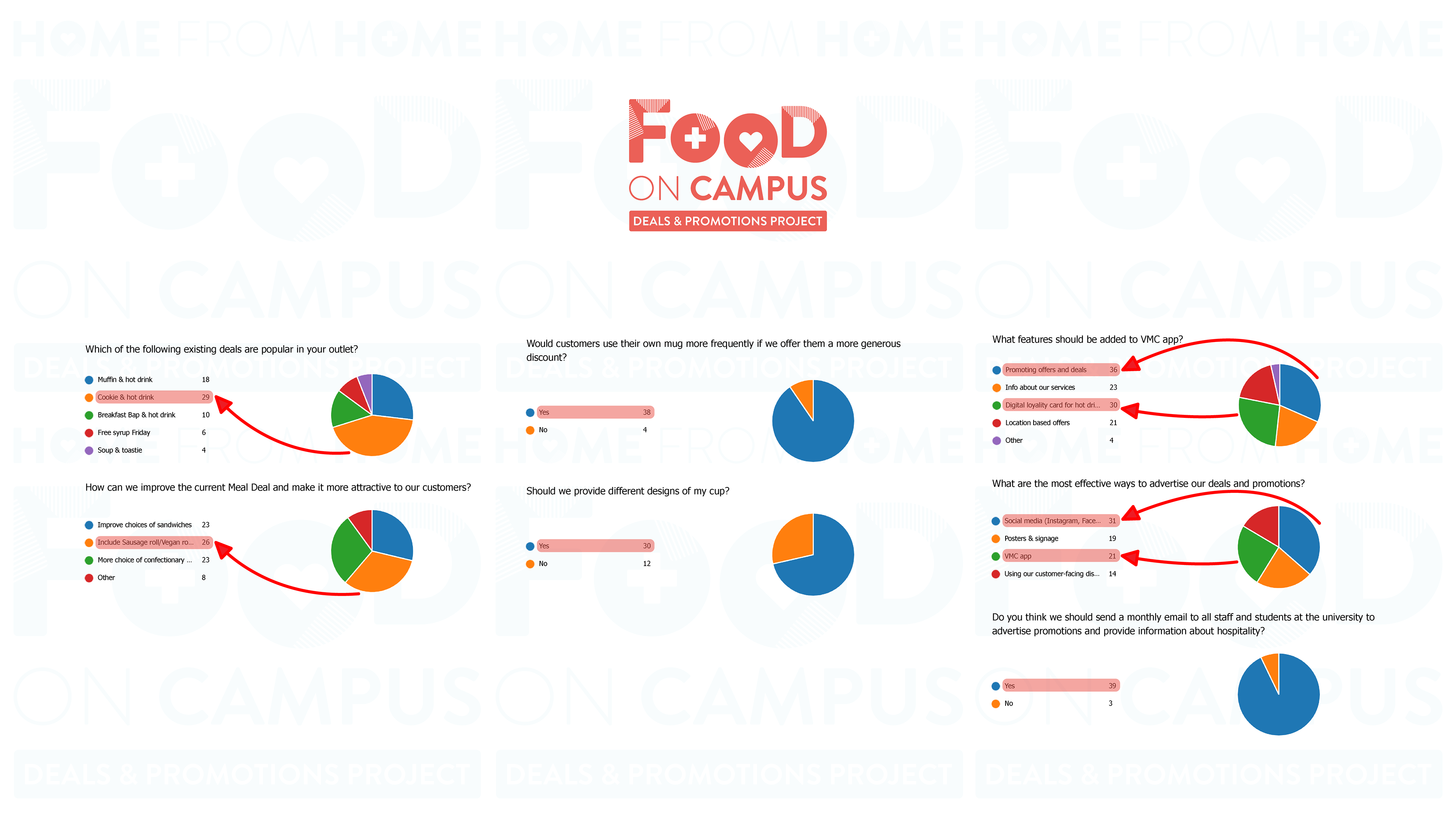
we have conducted exploratory research on the industry in the UK by researching on leader companies and how they’ve designed their mobile apps. We also done an internal usability research focusing on the application features and the pain points. Designed a style tile alongside with an unmoderated usability testing and desirability studies.
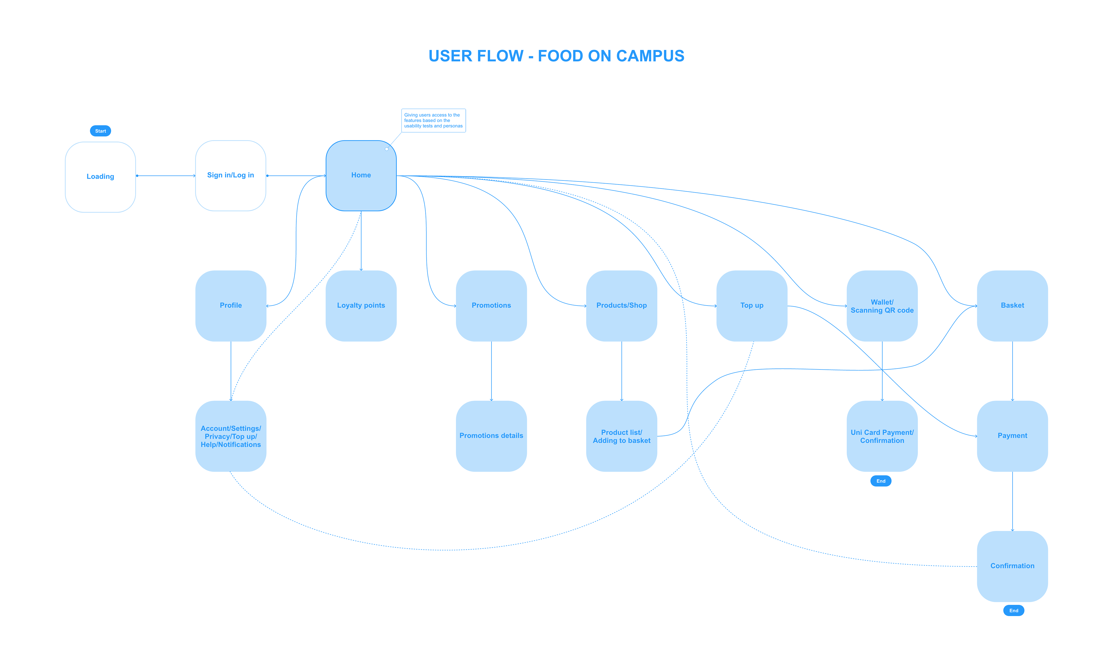
High fidelity wireframes has been designed and another set of usability testing took place. Vigilant personas has been designed and the process of ideation was started based on the outcomes.
A meeting took place with campus hospitality managers in regards to the final design direction.
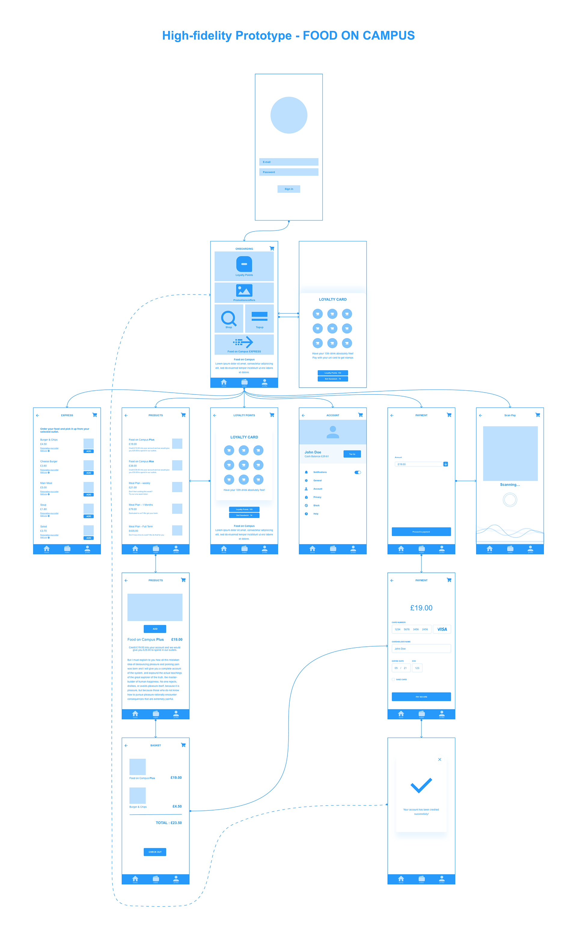
As there was a recent redesigning of the website, I’ve been provided by a design toolkit that includes colour palette and fonts using widely throughout the whole university website design. By doing so I’ve developed a unified look on the app and a smooth and connected UX transition from website to the application. ‘Food on Campus’ is Hospitality’s customer focused brand which is modern and fits perfectly alongside wider university branding.
High-fidelity prototype has been designed and went through the final usability testing.
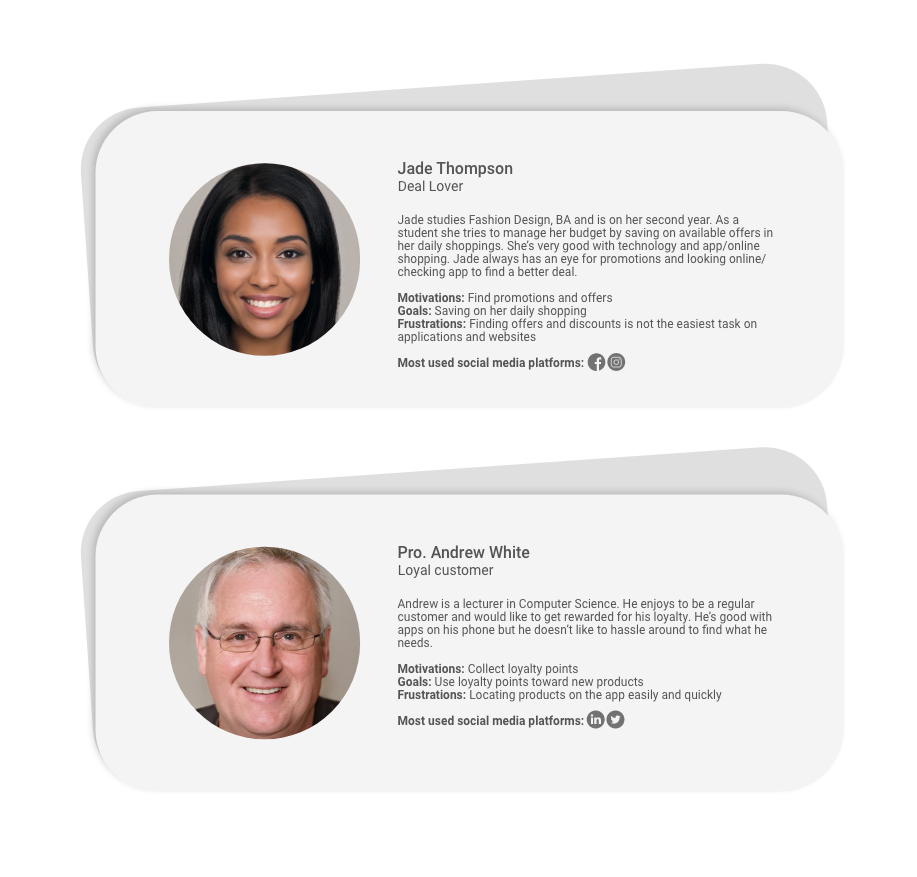
Personas:
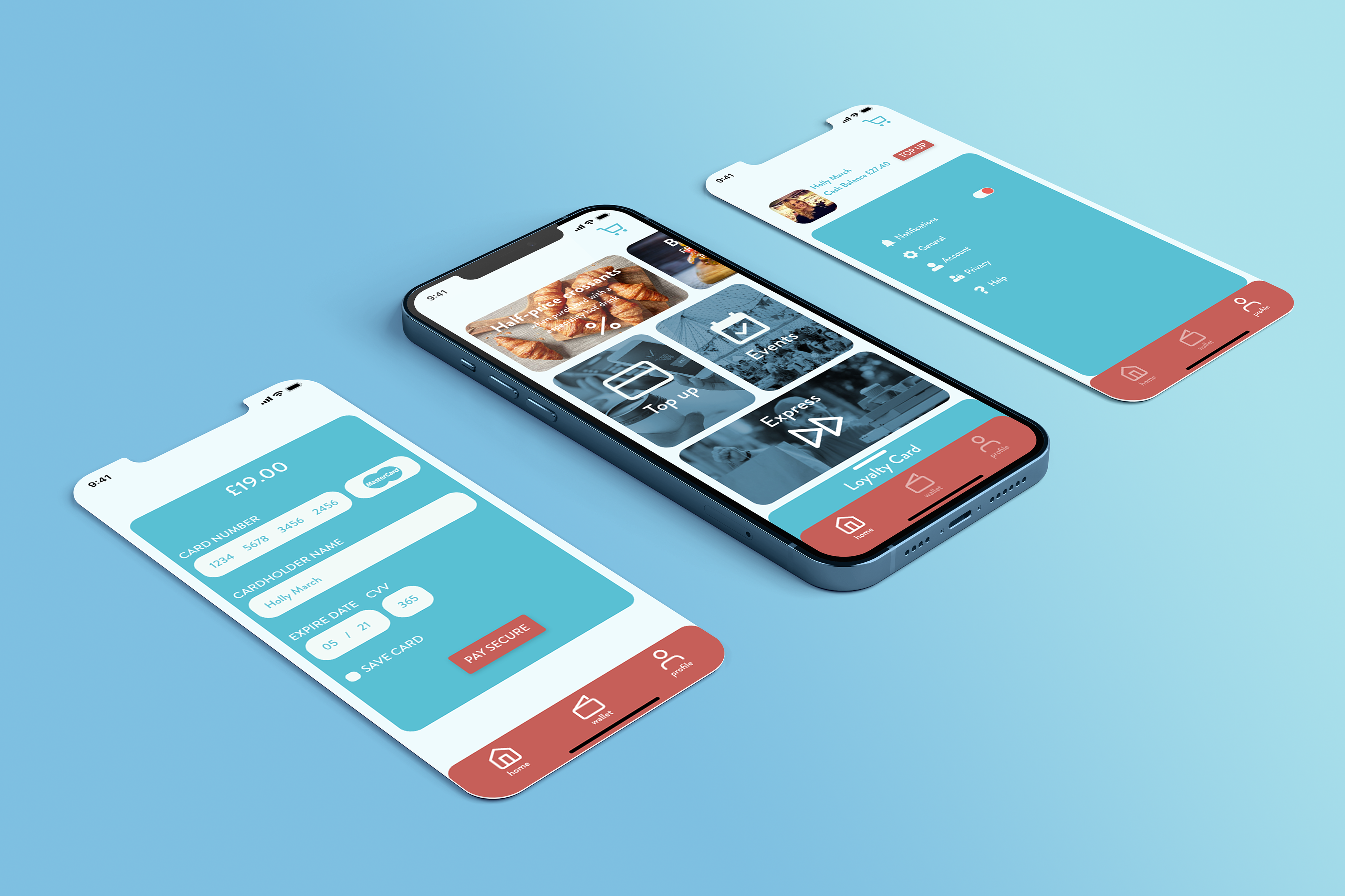
Based on the usability tests and personas I focus on the most important pain points to be the main goal in my design direction. Users would like to have access to promotion, offers and loyalty points on the main page. They are not keen on too much scrolling and going to different pages in order to find what they’re looking for.
Old Design:
The old design of the application is lacking visual hierarchy and design system.
There is no visual system such as colour palette and information architecture.
No usability test has been conducted and as the result we don’t have a functional app.
Old Design
New Design
New Design:
The new design of the application is energetic, vibrant and contemporary.
Using the same design tile as the website users experience a smooth transition from website to the the app.
Home page design give users access to all the features has been highlighted as main user pain points in earlier surveys.